What is the Analytics Engine?
The Analytics Engine lets analysts interrogate fused intelligence rather than simply read it. A pre-built dashboard tells you what the system already decided to show you. The engine goes further: it lets you slice the data however you want, test your own hypotheses against it, follow unexpected threads, and arrive at findings that are traceable, reproducible, and publishable.
The difference is the difference between reading a newspaper's finance page and having the market data in a spreadsheet of your own: the page tells you what its editor thought mattered; the spreadsheet answers whatever question you bring to it.
It is built on a single principle: every observation in Krataxis — regardless of whether it came from a conflict event, a health case, or a disaster record — shares the same shape. One set of statistical tools therefore works across all workbenches without modification.
This is not a statistics dashboard. A dashboard treats the analyst as a reader of pre-decided metrics. The engine treats the analyst as an investigator — someone who arrives with a question, not just a screen.
Two-Tier Design
Krataxis uses two distinct analytics tiers. They coexist — neither replaces the other.
Stats Panel (Tier 1 · Lightweight) — Sidebar → Stats tab
Instant totals, category mix, severity breakdown, and the 12-week mini-timeline. Results display without additional loading. Use it for at-a-glance situational awareness.
Analytics Engine (Tier 2 · Full Depth) — /analytics & /analytics/workbench
Full statistical analysis — exploration, decomposition, spatial statistics, significance tests, forecasting, investigations, reports. Loaded on demand; handles frames of up to 100,000 observations.
Quick tip: The Stats Panel now has an Open in Analytics Workbench → link at the bottom. It pre-fills the scope with the current battlespace and a 30-day window — a fast way to move from a quick glance to a full investigation.
Entry Points
There are several ways to reach the Analytics Engine, depending on where you are in the platform.
| Where you are | How to reach Analytics |
|---|---|
| Main nav bar | Click the 📊 Analytics button → opens the Analytics Dashboard at /analytics |
| Stats Panel (sidebar) | Open in Analytics Workbench → link at panel bottom → pre-fills current battlespace + 30-day window |
| Event Inspector | ↗ Explore in Workbench link at inspector bottom → opens Workbench scoped to ±7 days around the event date |
| Analysis Panel | Open in Analytics Workbench → button in panel header → uses current battlespace and 30-day window |
| Analytics Dashboard | Every panel has Explore this in the Workbench → — opens the Workbench pre-scoped to the panel's data |
Reading the Dashboard
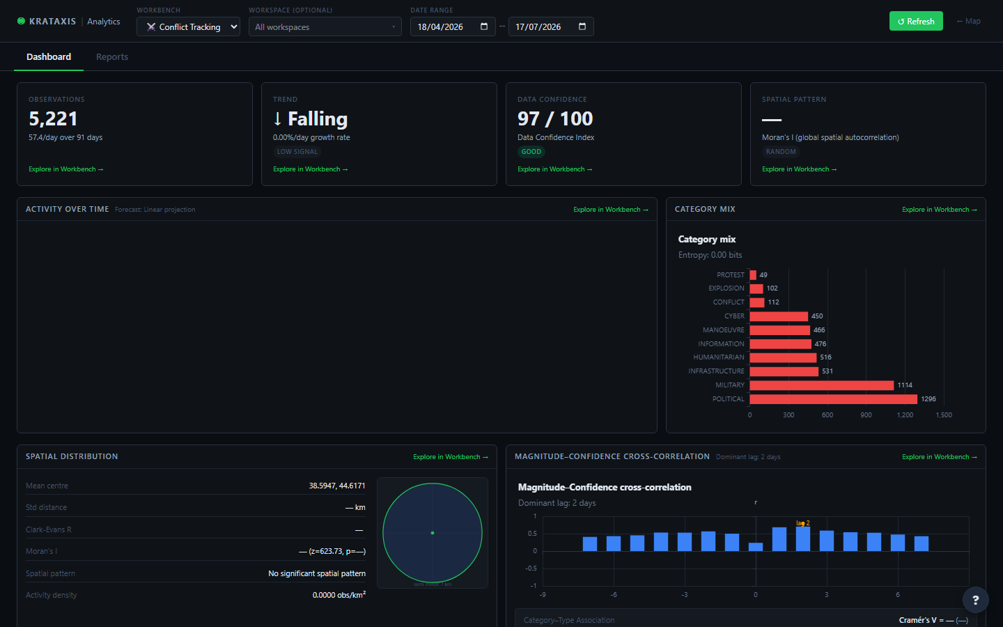
The Analytics Dashboard at /analytics gives you the standing picture: key metrics, trends, and spatial patterns for a chosen scope — without having to build anything. It is the right place to start when you want a quick sense of a situation before deciding whether it warrants a deeper investigation.
Setting Your Scope
The scope bar across the top controls what the dashboard shows. Three things to set:
-
Choose a workbench — Conflict, Health, or Disaster. Each uses the same statistical engine but maps its own entity types onto the shared observation model.
-
Pick a date range — From and to dates. The default is the last 30 days. Narrower scopes load faster; wider scopes provide more meaningful trends.
-
Optionally scope to a workspace — pick a battlespace from the selector to restrict all panels to a single workspace. Leave it unset for a workbench-wide view across all battlespaces you have access to.
Dashboard URLs are shareable. The scope bar is URL-synced — copy the address bar after setting your scope and anyone with access can open the same view.
The dashboard loads all seven statistical modules in parallel. Panels appear as their data arrives — fast panels (overview, categories) appear within a second; slower modules (spatial, forecast) fill in shortly after. Each panel shows a loading shimmer while computing.
Dashboard Panels
Summary Cards
Four headline metrics at the top of the page. Each has an Explore in Workbench → link that pre-seeds the Workbench with the current scope.
| Card | What it shows | Significance badge |
|---|---|---|
| Observations | Total observation count + observations-per-day rate over the selected period | — |
| Trend | Whether activity is rising or falling; growth rate %/day | Green = rising + R² > 0.3 (meaningful trend); grey = flat or noisy |
| Data Confidence | Data Confidence Index 0–100: a weighted composite of geo completeness, actor coverage, source diversity, and mean confidence score | Green ≥ 80; amber 60–79; red < 60 |
| Spatial Clustering | Moran's I — whether observations are spatially clustered, dispersed, or random | Clustered (I > 0.3), Dispersed (I < −0.3), Random |
Temporal Chart
A daily-binned activity timeline showing the observed series (blue), a 7-day simple moving average (dashed), and a forecast band extending beyond the last observation. Surge events — bins where activity is significantly above the rolling baseline — are marked with a red triangle. Lulls are marked in blue.
The forecast method shown is the one that performed best in a holdout backtest across several standard forecasting methods. The method name appears in the panel subtitle.
Category Mix
A horizontal bar chart of the top 10 categories by count. The Shannon entropy score below the title summarises how evenly spread activity is across categories — a low score means one category dominates; a score near log₂(n) means even distribution.
Spatial Panel
Spatial statistics for all geolocated observations. The right side of the panel shows a standard deviational ellipse: its orientation and axis ratio summarise where activity is concentrated and in which direction it is elongated.
Key statistics on the left:
| Statistic | What it means |
|---|---|
| Mean centre | Geographic centre of gravity (confidence-weighted) |
| Standard distance | RMS distance from the mean centre — the "radius" of typical activity |
| Clark-Evans R | Nearest-neighbour index. R < 1 = clustered; R = 1 = random; R > 1 = dispersed |
| Moran's I | Global spatial autocorrelation. Positive = nearby observations are similar; negative = checkerboard pattern; p-value indicates statistical significance |
| Activity density | Observations per km² within the convex hull of all geolocated activity |
Correlogram
Cross-correlation between the daily magnitude trend and the daily confidence trend at lags −7 to +7 days. A positive dominant lag means magnitude tends to precede confidence (early, lower-credibility reports of high-severity events). A negative lag means the reverse.
The Cramér's V card below the correlogram measures the association strength between category and entity type (event vs. intel item). Values above 0.3 indicate a meaningful relationship.
Data Confidence Index
A full-width breakdown of data quality across five dimensions. Each bar shows the completeness percentage for that dimension. The overall DCI score is a weighted sum — geo coverage and source confidence carry the most weight.
When DCI is below 60, treat statistical conclusions from this scope with caution: missing coordinates, low-confidence sources, or thin actor attribution reduce the reliability of spatial and association analyses.
The Investigation Workbench
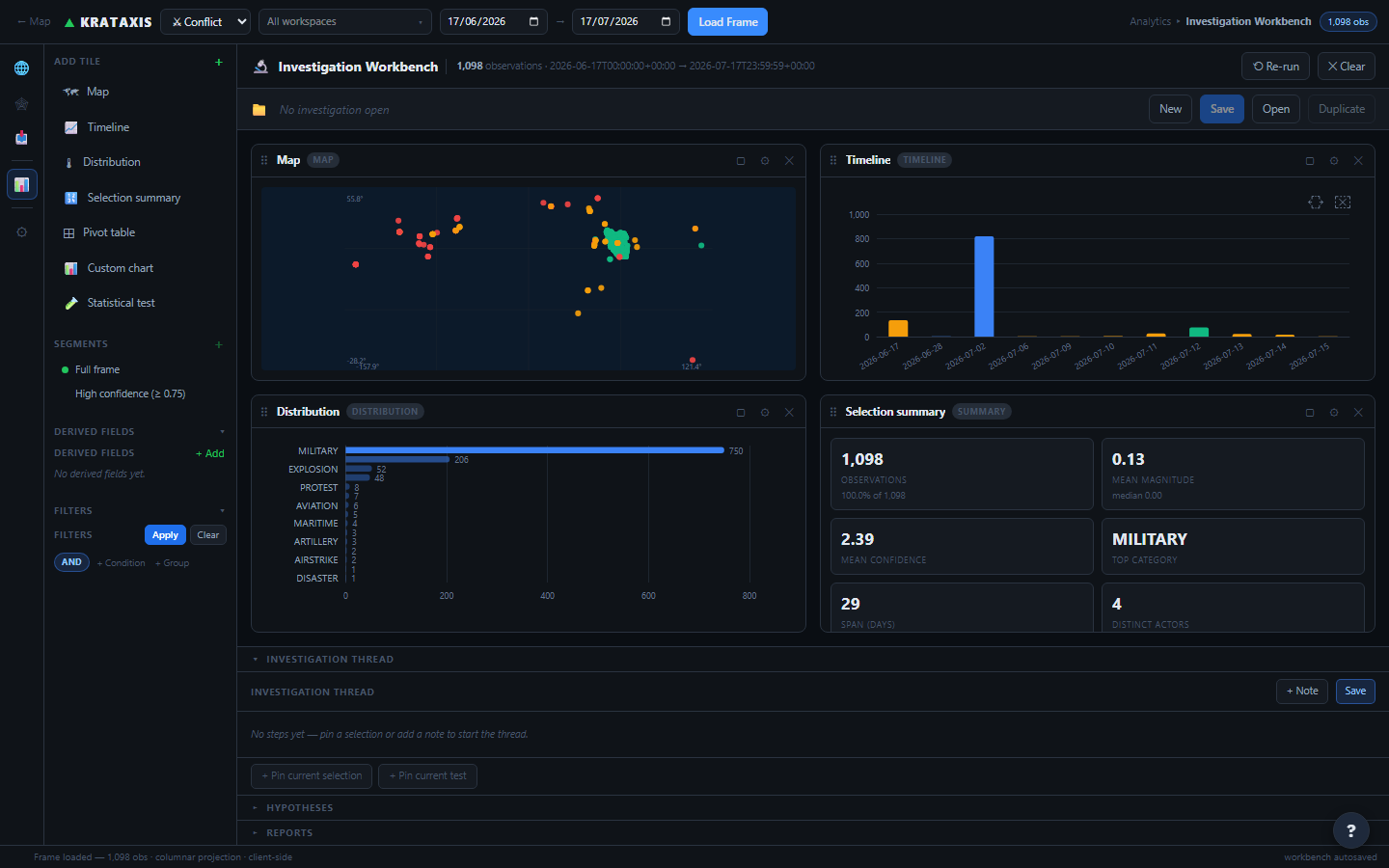
The Workbench at /analytics/workbench is where investigations actually happen. It is a canvas of live tiles where selections on any one tile immediately cross-filter every other with no loading delay.
Loading a Frame
The scope bar at the top works the same as the dashboard. Once you have set workbench, dates, and optionally a workspace, click Load Frame. The platform loads all observations matching the scope at once. From that point forward, all filtering, pivoting, and exploration happens at interactive speeds.
Frame size: Frames up to 100,000 observations load fully. If your scope is larger, you will see a truncation warning — narrow the date range or add a workspace filter to get the full dataset.
The Canvas
The canvas is a two-column grid of tiles. You can:
- Add tiles from the Add Tile menu in the left tools panel
- Drag tiles to reorder them (grab the ⠿ handle in the tile header)
- Remove a tile with the ✕ button in its header
- Configure a tile with the ⚙ button — controls field, aggregation, and chart type depending on the tile
The canvas layout (which tiles, in what order) is saved in your browser and restored on your next visit.
Tiles Reference
-
Timeline — Daily histogram of observation counts. Bar colour reflects mean magnitude. Brush a date range to select those observations across all other tiles.
-
Distribution — Horizontal bar chart for any categorical field (category, entity type, source, day of week, hour). Click a bar to select observations in that group.
-
Map — Geographic scatter plot of geolocated observations. Drag to draw a rectangle and select the observations inside it. Colour reflects magnitude.
-
Stat — Live descriptive summary of the current selection: count, % of total, mean/median magnitude, mean confidence, top category, and time span.
-
Pivot Table — Two-dimensional pivot: drag any two fields onto rows and columns, choose a measure. Click a cell to select those observations. Heat-shaded by value.
-
Custom Chart — Build any chart from scratch: choose mark type (bar, line, area, scatter, heatmap, boxplot), X and Y fields, colour encoding, and aggregation. Presets for common views.
-
Test — Run a statistical test on the current frame. Supports t-test, chi-square, Pearson/Spearman correlation, and cross-correlation. Results include effect size and a plain-language verdict.
Configuring a Distribution or Custom Chart Tile
Click the ⚙ icon on the tile header to open the configuration popover. For the Distribution tile, choose which field to group by. For the Custom Chart, the encoding panel slides in on the left side of the tile — pick mark type, X/Y channels, colour channel, and the aggregation to apply (count, mean, sum, median, etc.).
Any derived field you have defined (see Derived Fields) appears in these dropdowns alongside the native fields.
Cross-Filtering
Cross-filtering is the most powerful interaction in the Workbench. When you make a selection on any tile — brush a time range, click a category bar, draw a rectangle on the map — every other tile immediately recomputes to show only the selected observations.
The Selection Breadcrumb Bar
Once a selection is active, a breadcrumb bar appears above the canvas. Each step in your current selection is shown as a chip. You can:
- Click a chip to step back to that level of the selection
- Click Clear all to return to the full frame
Drill-down behaviour: Making a second selection intersects with the first — it narrows the selection further. For example: brush "January" on the Timeline, then click "airstrike" on the Distribution — you now have the airstrikes from January. Both breadcrumbs are visible and independently removable.
Practical Example
-
Brush a time range — Drag across a spike in the Timeline tile. The Distribution and Stat tiles update immediately to show only observations from that window.
-
Click a category — In the Distribution tile, click the "artillery" bar. Now you have the artillery incidents from the spike period.
-
Check the Map — The Map tile shows only those geolocated incidents. The Stat tile shows count, mean severity, and confidence for this exact subset.
-
Run a test on this selection — Open a Test tile. The test runs on the current selection — you're testing the artillery-during-spike period specifically.
Derived Fields
Derived fields let you compute a new column from any combination of the native fields using a simple formula language. Once defined, a derived field behaves exactly like a native field — you can use it as a chart axis, a pivot dimension, a filter condition, or a test variable.
Creating a Derived Field
In the left tools panel, scroll to the Derived Fields section and click + Add. Enter a name (no spaces; use underscores) and a formula. As you type the formula, a live preview shows the computed value for the first observation in the current frame.
Formula Language
Formulas use a restricted expression syntax. Field values are referenced with a @ prefix.
Arithmetic and comparisons
@magnitude * 2 @confidence >= 0.7 (@magnitude + @confidence) / 2
Conditional
if(@magnitude > 0.5, "high", "low")
Time functions
hourOfDay(@occurredAt) → 0–23 (UTC hour) dayOfWeek(@occurredAt) → 0=Sun … 6=Sat daysBetween(@occurredAt, now)
Math and binning
log(@value) clamp(@magnitude, 0.2, 0.8) bucket(@magnitude, 0.25) → 0, 0.25, 0.5, 0.75, 1.0 coalesce(@value, 0) → @value if non-null, else 0 distanceKm(@lat, @lon, 48.8, 2.3) → km from Paris
Available native fields: @magnitude, @confidence, @occurredAt (a timestamp), @category, @sourceId, @entityType, @lat, @lon, @value.
Useful patterns:
hourOfDay(@occurredAt) >= 20 || hourOfDay(@occurredAt) <= 4creates a "nighttime" boolean field.bucket(@magnitude, 0.2)discretises severity into five bands. Use these as Distribution or Pivot dimensions to uncover patterns invisible in continuous data.
Filters & Segments
Compound Filter Builder
The Filters section in the left tools panel lets you build nested AND/OR filter trees that apply instantly across the entire canvas. Unlike tile-based selections (which cross-filter), a filter here restricts the frame — tiles will only ever see the filtered observations.
Add a condition (field, operator, value), group conditions with AND or OR, and nest groups inside groups for complex logic. Click Apply to push the result to the selection bus. Click Clear to restore the full frame.
Segments
A segment is a named, saved filter predicate — for example, "High-confidence strikes" or "Night-time incidents". Segments are defined in the Derived Fields section and are reusable across tiles, pivot tables, and statistical tests. They are the unit the Comparative test type operates on: define Segment A and Segment B, then run a t-test to compare them.
Segments are saved within the investigation and persist when you save and reopen it.
Statistical Tests
The Test tile runs a statistical test on the current frame (or selection). Add it from the tile picker. Simple tests display results immediately. More complex tests may take a few seconds.
Test Types
| Test type | When to use | Output |
|---|---|---|
| Two-segment comparison | You want to compare two groups — e.g. daytime vs nighttime incidents, or before vs after an event. Define Segment A and Segment B (category filters, derived fields, or "current selection vs complement"). | Welch's t-test: t, df, p-value. Mann-Whitney U: U, z, p. Cohen's d effect size. Plain-language verdict. |
| Two categoricals | You want to know if two categorical variables are associated — e.g. category and entity type. | Chi-square: χ², df, p-value. Cramér's V effect size (weak/moderate/strong). Contingency table. |
| Two numeric fields | You want to quantify the relationship between two continuous variables — e.g. magnitude and confidence. | Pearson r and Spearman ρ (both with p-values). ECharts scatter. |
| Cross-correlation | You want to know whether one time series leads or lags another — e.g. does an increase in severity precede a decrease in source confidence by a few days? | Pearson correlation at lags −7 to +7 days. Bar chart. Dominant lag highlighted. |
Minimum sample size: Tests require at least 10 observations per group. Below this threshold the tile shows an "Insufficient sample" warning instead of results — a small sample makes p-values unreliable regardless of what they say.
Reading a Test Result
Every result shows the statistic, degrees of freedom, p-value, effect size, and a plain-language verdict. The significance framing used throughout the engine:
| p-value | Verdict phrasing |
|---|---|
| < 0.001 | "Highly significant" |
| < 0.05 | "Significant at α = 0.05" |
| < 0.10 | "Marginal (borderline)" |
| ≥ 0.10 | "No significant difference detected" |
Always read the effect size alongside the p-value. A test can be statistically significant but practically meaningless if the effect is tiny — and vice versa: a strong effect in a small sample may not reach significance. Cohen's d below 0.2 is negligible; 0.5 is medium; 0.8 and above is large.
Pinning a Test to the Thread
Once a test has run, click Pin to thread in the result card. The result — including its configuration, statistics, and verdict — is captured as a thread step and can be linked to a hypothesis.
Investigation Thread
The investigation thread is the ordered log of everything you have done during an investigation. It is displayed in a collapsible panel beneath the tile canvas. Think of it as a working notebook that captures not just your conclusions, but the reasoning trail that led to them — making your analysis reproducible and auditable.
Step Types
-
Query — A filter or selection state — captures which observations you were looking at and why.
-
Chart — A snapshot of a tile configuration and its rendered chart at that moment.
-
Test — A statistical test result — method, statistics, and verdict.
-
Note — Free text — analyst commentary, context, caveats, or questions.
-
Finding — A highlighted note marking a key conclusion. Findings can be linked to hypotheses and included in reports.
Adding Steps
- Pin current selection — captures the active selection bus state as a Query step
- + Note — opens an inline text area; press Enter to save
- Click ⭐ on any step — promotes it to a Finding
- Pin to thread in a Test tile result — adds a Test step
- Use the ↑↓ arrows to reorder steps
- Click ✕ on a step to remove it
Hypothesis Register
The hypothesis register, below the thread, is where you formalise your analytical questions and track the evidence that bears on them. This is the surface where Krataxis most directly supports its core mission: arriving at defensible ground truth.
Creating a Hypothesis
Click + New in the Hypothesis panel. Write a statement — a specific, falsifiable claim about the data. For example: "The increase in artillery incidents in sector 4 during week 3 correlates with a degradation in source confidence, suggesting coordinated deception."
Attaching Evidence
Attach thread steps to a hypothesis as evidence for or against it. For each piece of evidence you specify:
- Which thread step (select from a dropdown)
- Whether it is for or against the hypothesis
- An optional explanatory note
Setting a Verdict
Once you have gathered enough evidence, set a verdict using the buttons at the bottom of the hypothesis card:
                Open
                Under investigation

                Supported
                Evidence is consistent

                Refuted
                Evidence contradicts it

                Inconclusive
                Evidence is mixed
ACH Integration
Each hypothesis has an Export to ACH → button that opens the Analysis of Competing Hypotheses worksheet in the Analysis Panel, pre-populated with the hypothesis statement. This is a one-way handoff — ACH is the right tool when you have multiple competing hypotheses and need to evaluate them systematically against a set of indicators.
Saving & Sharing Investigations
An investigation stores its scope (the FrameSpec — workbench, dates, filters, derived fields), the canvas layout, and the full investigation thread. It does not store the raw observation data — re-opening an investigation re-resolves the same scope against the current data. This means the investigation is always fresh: if new observations arrive that fall within the scope, they will be included next time.
Saving
Click the 💾 Save button in the investigation bar at the top of the Workbench. If there are unsaved changes, an amber "unsaved changes" badge appears. Each save creates an immutable version snapshot — you can see earlier versions of your investigation if you need to recover a previous state.
Creating and Opening
New starts a blank investigation in the current scope. Open shows a list of your saved investigations scoped to the current workbench and battlespace. Duplicate copies an investigation as a private starting point for a related analysis.
Sharing
Each investigation has a Sharing setting accessible from the investigation menu:
| Setting | Who can see it |
|---|---|
| Private (default) | Only you |
| Workspace | All members of the linked battlespace |
| Team | All authenticated users on the platform |
Workspace and Team sharing exposes the investigation's structure (thread, hypotheses, derived fields). Other analysts who open the investigation will see the same frame re-resolved against their own access rights. They will not see observations from battlespaces they do not belong to.
Generating Reports
A report is the output of an investigation — not a canned dump of whatever the system decided to show. The Reports tab appears in both the Dashboard and the Workbench. It lists previously generated reports and lets you create new ones.
Report Templates
| Template | What it includes | Best for |
|---|---|---|
| Snapshot | Descriptive statistics only — observation count, category mix, confidence distribution | A quick data health check or a starting-point summary |
| Brief | Descriptive + temporal trend summary + surge/lull flags | Daily or weekly situation briefs |
| Trend | Descriptive + full temporal analysis + forecast | Trend analysis over a significant period |
| Comparative | Descriptive + side-by-side comparison of two periods or two groups | Before/after comparisons; benchmarking |
| Spatial | Descriptive + full spatial analysis (ellipse, KDE, Moran's I) | Geographic pattern analysis |
| Dossier | All eight statistical modules in full | Comprehensive assessments |
| Investigation | Renders the investigation thread as a report — analyst's notes, findings, charts, and test results in their own order | The primary output of a Workbench investigation; captures the analyst's reasoning, not just the statistics |
Generating and Downloading
Select a template, enter a title, and click Generate. The report is generated and saved — the page shows a spinner while it runs. Once complete, download it in any of four formats:
-
HTML — Self-contained file with inline charts (SVG). Open in any browser, share as an attachment, or publish directly from the platform.
-
Markdown — Portable text with section headers and statistics tables. Paste into any document system.
-
JSON — The complete structured report payload. Useful for archiving or integration with other tools.
-
CSV — Flat table of the key statistics per section. Import into Excel, R, or any analytics tool.
Approval
Before a report can be published, it must be approved. The analyst who generated it can request approval; workspace owners and platform admins can approve. Once approved, the Approve ✓ badge appears on the report card and the Publish button becomes available.
Approval is a deliberate gate — it ensures that intelligence products that leave the platform have had at least one review step.
Publishing Reports
Publishing creates a public-facing web page for an approved report, accessible via a secure link without requiring login. Published reports are intended for sharing findings with people outside the Krataxis platform.
Publishing makes intelligence public. Before publishing, confirm that the report contains no sensitive source details, internal UUIDs, or battlespace internals that should remain restricted. The platform audits every publish and unpublish action.
Publishing Workflow
Once published, the Publish panel on the report card shows:
- The public link — copy it to share
- The current drift status (see next section)
- Unpublish — disables the link immediately; the URL returns 404
- Republish with current data — generates a fresh version of the report against today's data, publishes it, and marks the previous version as superseded
The Snapshot Principle
A published report renders from a frozen snapshot taken at publish time. It will not silently change as the underlying data evolves. This is intentional: it protects the published finding. An analyst who states that "87 strikes were recorded in January" in a published report should not find that number has changed months later because two strikes were retroactively re-geolocated.
Drift Detection
Krataxis data is continuously re-ingested and re-scored. Facts change. The drift detection system re-runs the report's original scope against live data daily and compares the result to the frozen snapshot. It does not alter the published report — it reports the discrepancy honestly.
Three states appear as a banner at the top of a published report page:
                Verified
                Re-resolved data matches the frozen snapshot as of the check date. The finding stands unchanged.

                Drifted
                The underlying data has changed — e.g. "3 observations have since been added to this period." The report still renders from the frozen snapshot; the reader is simply informed of the discrepancy.

                Unknown
                The original scope could not be re-resolved — the workbench or battlespace may no longer exist.
If you need to update the published finding to reflect new data, use Republish with current data. This generates a fresh report and marks the old version as superseded — the old link will show a notice that a newer version is available.
Statistics Glossary
A plain-language reference for the statistical terms used across the engine.
| Term | What it means in plain language |
|---|---|
| p-value | The probability of observing a result this extreme if there were truly no effect. A small p-value means the result is unlikely to be due to chance. It does not tell you how large or important the effect is. |
| Cohen's d | Effect size for two-group comparisons. How many standard deviations apart are the group means? < 0.2 = negligible; ~0.5 = medium; ≥ 0.8 = large. |
| Cramér's V | Effect size for categorical associations (chi-square). 0 = no association; 1 = perfect association. < 0.1 = weak; 0.1–0.3 = moderate; ≥ 0.3 = strong. |
| Pearson r | Linear correlation between two numeric variables. −1 = perfect negative, 0 = no linear relationship, +1 = perfect positive. |
| Spearman ρ | Rank correlation — like Pearson but based on ranks rather than raw values. More robust when the relationship is monotonic but not necessarily linear. |
| Moran's I | Global spatial autocorrelation. Positive = nearby observations tend to be similar (clustering); negative = dissimilar neighbours (checkerboard). p-value indicates whether the pattern is statistically significant. |
| Shannon entropy | Diversity of a categorical distribution, measured in bits. A single category gives 0 bits; perfectly even distribution across k categories gives log₂(k) bits. Normalised entropy divides by log₂(k) to give a 0–1 score. |
| Gini coefficient | Inequality in a distribution. 0 = all actors equally active; 1 = all activity from one actor. |
| Herfindahl index | Sum of squared market shares (here: source shares). 1/n = perfectly uniform; 1.0 = one source dominates. Used to assess source concentration in the DCI. |
| Holt-Winters | An exponential smoothing forecast that models level, trend, and seasonality. Generally outperforms naive forecasts when there is a weekly pattern in the data. |
| CUSUM | Cumulative sum control chart. Detects the approximate date when the mean of a time series shifted — a change-point detection method. |
| Data Confidence Index | A 0–100 composite score summarising data quality across several dimensions — geo completeness, actor coverage, category completeness, source completeness, mean confidence, and source diversity — with geographic coverage and source confidence weighted most heavily. |
Formula Language Reference
The formula language is used in derived fields, compound filters, and segment definitions. It uses a restricted expression syntax.
Field References
| Reference | Type | Description |
|---|---|---|
@magnitude |
Number (0–1) | Normalised event severity / case severity / Richter scale |
@confidence |
Number (0–1) | Source confidence / validity score |
@occurredAt |
Timestamp | Event timestamp in UTC |
@category |
Text | Event category, pathogen ID, hazard type, etc. |
@sourceId |
Text | Source identifier |
@entityType |
Text | "event", "intel_item", "health_case", or "hazard" |
@lat, @lon |
Number | Geographic coordinates |
@value |
Number | Optional secondary numeric (e.g. case count) |
Functions
| Function | Arguments | Returns |
|---|---|---|
if(cond, a, b) |
condition, true value, false value | a if cond is truthy, else b |
hourOfDay(ts) |
a timestamp | UTC hour 0–23 |
dayOfWeek(ts) |
a timestamp | 0=Sun, 1=Mon … 6=Sat (UTC) |
daysBetween(ts1, ts2) |
two timestamps | absolute difference in days |
bucket(value, step) |
numeric value, bin width | floor(value/step) × step — discretises continuous values |
log(value) |
positive number | natural logarithm |
clamp(value, min, max) |
three numbers | value constrained to [min, max] |
coalesce(a, b) |
any two values | a if non-null/NaN, else b |
distanceKm(lat1, lon1, lat2, lon2) |
four decimal degrees | distance in km |
Performance Notes
| Frame size | Behaviour |
|---|---|
| Smaller frames | Load quickly; tiles, brushing, pivoting, and tests are effectively instant. |
| Up to 100,000 obs | Load fully and stay interactive. The heavier modules (spatial, forecast) take a moment to compute on first load, then are fast on subsequent loads. |
| Over 100,000 obs | A truncation banner appears and the frame is capped. Narrow the date range or add a workspace filter to work with the full dataset. |
Dashboards open fast. Common views for active workspaces are kept warmed in the background, so the Analytics Dashboard loads promptly for any workspace with recent activity.
Real-Time Surge Alerts
When a new activity surge is detected in a workspace you have access to, a brief in-app notification appears — "Analytics: surge detected in [workspace]" — with no page refresh needed. Click it to open the Analytics Dashboard scoped to that workspace.