Introduction
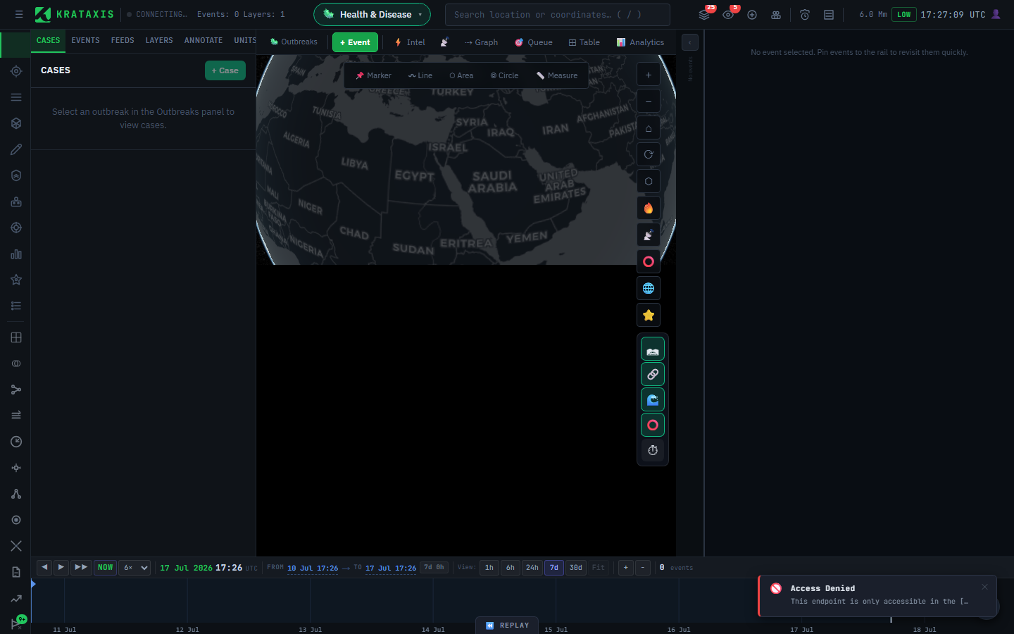
The Health Workbench is a domain context within Krataxis designed for epidemiological intelligence. It sits alongside the Conflict and Disaster workbenches and can be activated at any time without losing your conflict workspace.
If you have already worked the Conflict workbench, the good news is that you are not starting over. The whole platform runs on the same machinery underneath — the same container, the same pipeline, the same credibility scoring. What changes is the vocabulary on top: where a conflict analyst tracks events and actors, an epidemiologist tracks cases and pathogens. Learn the translation and the workbench falls into place.
The workbench organises data around Outbreaks — the health equivalent of Battlespaces. An outbreak is to a disease event exactly what a battlespace is to a conflict: a named container that scopes everything you see. Each outbreak scopes all downstream data: patient cases, exposure events, transmission links, and computed epi metrics are all tied to the active outbreak.
-
Outbreaks — Named disease events that scope all health data. Equivalent to a Battlespace in the conflict domain.
-
Patient Cases — Individual case records with clinical metadata, geo-coordinates, travel history, and symptom onset dates.
-
Exposure Events — Shared exposure opportunities — flights, gatherings, workplaces — linked to multiple cases to identify common sources.
-
Transmission Chain — a graph of who-infected-whom, auto-detected and visualised as a tree.
-
Epi Metrics — Live Rt, doubling time, CFR, and geographic spread computed hourly and displayed with trend sparklines.
-
Causal Graph Dock — Force-directed graph of the entire outbreak visible alongside the map. Draw transmission links directly on the graph with a two-tap flow.
-
Pathogens — a built-in disease-agent catalog with R₀, CFR, incubation range, and transmission routes. Custom entries can be added.
Switching Workbenches
Switching workbenches is like changing the lens on a camera rather than picking up a different camera — the body stays put, your other work stays loaded, only what you are looking at changes. The workbench switcher is the pill button in the centre of the header, between the Krataxis logo and the geocoder search bar.
-
Click the workbench pill — The pill shows the current workbench name and icon (e.g. ⚔ Conflict). Click it to open the workbench dropdown.
-
Select Health & Disease — Click the 🦠 Health & Disease option. The header updates immediately and the health rail buttons appear on the left navigation rail.
-
Selection persists across refreshes — Your workbench choice is saved automatically and restored on the next page load.
💡 Switching workbenches does not clear your conflict battlespace or any map data. Both domains coexist — you can switch back and forth without losing context.
Core Workflow
The typical analyst workflow moves left to right through the domain: define the outbreak → add cases → record shared exposure events → review auto-detected transmission links → monitor computed metrics.
Workflow: Create Outbreak → Add Cases → Exposure Events → Review Chain → Draw Links → Monitor Metrics
Every panel is independent — you do not need to complete each step before moving to the next. The system will auto-detect transmission links and recompute epi metrics in the background after each case is saved.
Outbreaks
Outbreaks are the top-level container for all health intelligence. You must activate an outbreak before any other health panel will load data.
Opening the panel
Click 🦠 Outbreaks in the header (replaces the Battlespace button when health workbench is active), or click the 🦠 button on the left rail.
Creating an outbreak
-
Click + New — Opens the New Outbreak modal.
-
Enter a name — Use a descriptive, date-tagged name such as "DRC Mpox Cluster 2026-04" or "H5N1 Poultry Workers — Qinghai".
-
Optionally add a description — A brief situation summary — index case, date of first report, geographic scope.
-
Click Create Outbreak — The outbreak is saved, the panel closes, and the new outbreak becomes the active scope for all downstream panels.
Activating an existing outbreak
Click any outbreak card in the list. The selected card is highlighted in teal and the system immediately loads its cases, exposure events, and epi metrics in the background.
⚠ Only one outbreak can be active at a time. Switching outbreaks clears the case list, map pins, and epi metrics display. Previously entered data is not deleted.
Patient Cases
The Cases panel lists all patient records for the active outbreak, paginated 50 per page. Cases with coordinates appear as coloured pins on the globe simultaneously.
Opening the panel
Click the 👤 button on the left rail.
Creating a case
ℹ You must have an active outbreak before creating a case. The + Case button is disabled if no outbreak is selected.
-
Click + Case — Opens the New Case modal.
-
Set the status — Choose the clinical classification: Suspected, Probable, Confirmed, Recovered, or Deceased. Defaults to Suspected.
-
Fill in available metadata — Pathogen, age group, symptom onset date, location name, and coordinates are all optional — enter what you have. A case reference is auto-generated if left blank.
-
Click Create Case — The case is saved. The system immediately runs the auto-detection algorithm in the background to find potential transmission links to existing cases.
Updating case status from the list
Each case card has a coloured status pill in the top-right corner. This is a live dropdown — click it and select the new status to update immediately without opening the inspector.
            Suspected
            Meets clinical criteria, not yet lab-confirmed

            Probable
            Epi link to confirmed case, lab pending

            Confirmed
            Lab-confirmed positive result

            Recovered
            Case resolved, no longer infectious

            Deceased
            Fatal outcome
Map integration
Any case with latitude and longitude coordinates is plotted on the globe as a small circle, coloured by status. The pins use the same colour scheme as the status badges above and are clamped to the terrain surface.
Case Inspector
Click any case card in the Cases panel to open the Case Inspector — a detailed side view showing all metadata for that patient record.
What the inspector shows
| Section | Contents |
|---|---|
| Header | Case reference, inline status dropdown (auto-saves on change) |
| Key facts | Pathogen, age group, onset date, location, coordinates, report date |
| Transmission | Incoming source count, outgoing contact count, View Chain button |
| Travel history | Leg-by-leg itinerary: from → to, date, carrier (if recorded) |
| Exposure events | Linked shared exposure opportunities with type and date; + Link button to add new links |
| Notes | Clinical free-text notes |
| Source | Clickable URL to the original report or case notification |
Linking exposure events
-
Click + Link in the Exposure Events section — Opens the exposure event picker.
-
Select the event and the patient's role — Roles: Exposed, Symptomatic at time, Crew / staff, Caregiver, Household contact.
-
Click Link Event — The case–event relationship is saved. The exposure event panel will now show this case in its linked-cases list.
Viewing the transmission chain
Click 🔗 View Chain inside the inspector to open the Transmission Chain panel seeded with the current case as the root node.
Route & Clinical Events
The Route & Clinical Events panel — accessible inside the Case Inspector — lets analysts build a geographic travel history for a patient as a sequence of waypoints, and attach clinical events (onset, test, hospitalisation) to specific points in that journey.
ℹ Where to find it: open the Case Inspector for any case, then scroll past the Transmission section. The Route & Clinical Events panel appears at the bottom with two tabs: Route and Clinical Events.
Route tab — waypoint timeline
Each waypoint represents a location the case visited. Waypoints are ordered by sequence and displayed as a vertical timeline with phase-coloured dots:
| Phase colour | Meaning |
|---|---|
| Blue | Pre-symptomatic — before the case's first symptomatic clinical event |
| Amber | Symptomatic — after symptom onset, potentially infectious |
| Red | Post-outcome (deceased) — after fatal outcome |
| Green | Post-outcome (recovered) — after recovery |
Adding a waypoint
-
Click + Waypoint — Opens the waypoint form.
-
Set waypoint type and transport mode — Type: Departure, Transit, Stop, Arrival. Transport: Flight, Sea, Road, Rail, Unknown.
-
Enter location and dates — Location name, lat/lng, carrier name, arrived-at and departed-at timestamps. All fields except location name are optional — enter what is known from the source report.
-
Save — The waypoint is appended to the sequence. Drag the ⠿ handle on any row to reorder. The route is saved in the new sequence automatically.
Importing from legacy travel history
If the case record already has a free-text travel history field (from earlier data entry), click ⬆ Import travel history at the top of the Route tab. The system converts each travel leg in the JSON field to a waypoint and clears the raw field. This action cannot be reversed.
⚠ Import parses the legacy format only once. If you have already imported or the field contains free-form text rather than structured JSON, no waypoints will be created.
Clinical Events tab
Clinical events record key moments in the patient's disease course — symptom onset, test result, hospitalisation, ICU admission, recovery, or death — each with a timestamp and optional geographic anchor.
| Event type | Description |
|---|---|
| Symptomatic | First recorded symptom onset — this anchors the phase boundary on the route |
| Tested | Laboratory test performed; result field accepts Positive / Negative / Pending |
| Hospitalised | Hospital admission |
| ICU | Transfer to intensive care |
| Quarantined | Isolation or quarantine measure applied |
| Recovered | Clinical resolution |
| Deceased | Fatal outcome — triggers post-outcome phase colouring on the route |
Each clinical event can be anchored to a specific waypoint — this places the event marker at the waypoint's coordinates on the Outbreak Map Layer.
Map integration
Once a case has at least two waypoints, a 📍 Route badge appears on its card in the Cases panel. Clicking Show route on map in the inspector renders the full route in the Outbreak Map Layer with phase-coloured line segments and clinical event markers.
Exposure Events
Exposure events represent shared opportunities for transmission — a specific flight, a conference, a hospital ward — that potentially connect multiple cases. Creating them here makes them available to link from any case's inspector.
Opening the panel
Click the 📍 button on the left rail (health section).
Event types
Events are divided into exposure source types (where infection may have occurred) and dispersal types (where a potentially infectious person seeded secondary contacts).
| Type | Category | Examples |
|---|---|---|
| Flight | Exposure | QF9 SYD–LHR, specific seat rows, crew members |
| Gathering | Exposure | Conference, wedding, mass gathering, market |
| Workplace | Exposure | Abattoir, poultry farm, laboratory, office floor |
| Healthcare | Exposure | Ward, ICU, outpatient clinic, dialysis centre |
| Household | Exposure | Family cluster, shared dwelling |
| Unknown | Exposure | Source under investigation |
| Vessel disembarkation | Dispersal | Cruise ship port call; passengers dispersing to multiple destinations |
| Port stop | Dispersal | Intermediate port; crew or passengers temporarily ashore |
| Mass dispersal | Dispersal | Stadium exit, airport transit, train terminus |
💡 Dispersal events show a 🌊 traced/total ratio on their card — e.g. 🌊 8/280 — showing how many of the known dispersed contacts have been traced as cases. Fill in Total Known Contacts when creating the event to enable this ratio.
Creating an exposure event
ℹ An active outbreak must be selected before you can create exposure events. The + Event button is disabled otherwise.
Click + Event, fill in the type, a descriptive name, and any available date, location, and coordinates. Click Create. The event then appears in the list and is immediately available to link from case inspectors.
Viewing linked cases
Click any event card to expand it. The detail view shows the number of linked cases with their reference numbers and current statuses. Use this to quickly see which cases attended the same exposure opportunity.
Transmission Chain
The Transmission Chain panel visualises who-infected-whom as a tree graph, starting from a selected index case. Links are scored and surfaced automatically; analysts then confirm or rule them out.
Opening the panel
Click the 🔗 button on the left rail, or click 🔗 View Chain inside the Case Inspector. When opened from the inspector, the selected case is pre-loaded as the root.
How auto-detection works
Every time a case is created or updated, the system evaluates potential links to existing cases in the background, weighing several signals:
| Signal | What it captures |
|---|---|
| Temporal proximity | Onset dates falling within the pathogen's serial interval |
| Spatial proximity | How geographically close the two cases are |
| Shared exposure event | Both cases linked to the same exposure opportunity |
| Travel overlap | Matching travel legs in the same timeframe |
Reviewing suggestions
Auto-detected links appear below the chain graph with a confidence score. For each suggestion you can:
- ✓ Confirm — promotes the link to confirmed status and adds it to the chain graph
- ✕ Dismiss — marks the link as ruled out and removes it from future suggestions
Adding links manually
If you identify a transmission link not caught by auto-detection, use the Outbreak Causal Graph Dock (🕸 button on the rail) to draw it directly on the graph. See the Causal Graph Dock section for the full two-tap workflow.
💡 Click ⟳ Refresh at any time to re-run the scoring algorithm for the selected case. This is useful after adding new exposure events or updating travel history.
Movement Clusters
Movement Clusters are groups of cases that share a common carrier or location along their geographic routes. The system automatically detects them after each new waypoint is saved and surfaces them in the Epi Metrics panel below the metric cards.
How clusters are detected
After a waypoint is saved, the system looks for two kinds of cluster in the background:
| Cluster type | What it groups |
|---|---|
| Carrier | Cases that share the same carrier (e.g. flight number or vessel name) within a short window |
| Location | Cases with waypoints close to each other within a short window |
As a cluster grows, the system raises an analyst notification so it does not go unnoticed in a busy outbreak.
Reviewing clusters
Clusters appear as cards in three tabs:
| Tab | Meaning |
|---|---|
| Pending | Auto-detected; awaiting analyst review |
| Confirmed | Analyst has verified the cluster is genuine |
| Dismissed | Analyst has ruled it out as a false positive |
Confirming or dismissing a cluster
-
Click Confirm or Dismiss on the cluster card — A notes dialog opens. Optionally enter a rationale.
-
Click Save — The cluster moves to the Confirmed or Dismissed tab. Confirmed clusters are drawn as coloured halos on the Outbreak Map Layer (red for confirmed, amber for pending). Dismissed clusters are hidden from the map.
View on map
Click View on map on any cluster card to fly the globe camera to the cluster's centroid and zoom to fit the halo.
Outbreak Causal Graph Dock
The Causal Graph Dock opens a resizable panel docked to the right of the map, showing the complete outbreak as a force-directed node graph. Unlike the Transmission Chain panel — which shows a tree rooted on a single selected case — the graph dock always shows every case and every link in the active outbreak simultaneously.
Opening the dock
Click the 🕸 button on the left navigation rail (visible when the Health workbench is active). The dock slides in from the right. Click the same button again, or click ✕ in the dock header, to close it.
Resizing the dock
Hover over the left edge of the dock — the cursor changes to a column resize cursor and the edge highlights in amber. Drag left to widen, right to narrow. The dock can be resized between 280 px and 900 px. The force layout re-settles automatically after a resize.
Reading the graph
Each node represents a patient case, colour-coded by clinical status using the same scheme as the map pins. The index case (earliest onset date) is rendered slightly larger with a white border ring. Directed edges point from source to target and are colour-coded by link type:
| Link type | Colour | Style |
|---|---|---|
| Possible | Grey | Dashed |
| Probable | Blue | Solid |
| Confirmed | Teal | Solid |
| Ruled Out | Red | Solid, 25% opacity |
A confidence percentage is shown on each edge midpoint. Toggle the 👁 / 🚫 button in the dock header to show or hide ruled-out links without deleting them.
Navigating the graph
| Action | How |
|---|---|
| Pan | Click and drag on any empty area of the canvas |
| Zoom | Scroll wheel over the canvas |
| Move a node | Click and drag the node circle; release to lock the new position |
| Open Case Inspector | Click a node (without dragging) — opens the inspector in the sidebar |
| Reload graph | Click ↻ in the dock header to re-fetch data and re-run the force layout |
ℹ Click vs drag: A small pointer movement counts as a click and opens the inspector. Natural mouse jitter will not accidentally reposition a node.
Drawing a transmission link
The ⇢ Link button in the dock header enters link-drawing mode. An amber status bar below the header guides you through the two-tap flow.
-
Click ⇢ Link — The canvas cursor changes to a crosshair and the amber bar shows "Click a source case node". Normal case-select behaviour is suspended until you exit link mode.
-
Click the source (from) case node — The node gains an amber ring. The bar updates to "[Case ref] → click a target case node". A dashed amber preview line follows your cursor showing the intended link direction. Click the source node again to deselect and choose a different source.
-
Click the target (to) case node — The amber bar expands into the link confirmation form inline.
-
Set link type and confidence — Choose a type from the dropdown (Possible, Probable, Confirmed, or Ruled Out) and drag the confidence slider (0–100%). Defaults are Probable / 75%.
-
Click ✓ Create Link — The link is saved and the graph edges refresh immediately — node positions are preserved. The bar resets to the instruction state so you can draw the next link without re-entering link mode.
💡 Click Cancel in the confirmation form to go back to target selection while keeping the source node selected. Click ✕ in the instruction bar, or press ⇢ Link again, to exit link mode entirely.
⚠ Self-loops are not permitted. The system will reject a link where the source and target are the same case.
Epi Metrics
The Epi Metrics panel displays the four key epidemiological indicators for the active outbreak, refreshed automatically and recomputed on demand.
Opening the panel
Click the 📊 button on the left rail.
            Effective Rt
            2.4
            Reproduction number

            Doubling Time
            6.1d
            Days to double

            CFR
            3.2%
            Case fatality rate

            Spread
            4
            Districts affected
The Rt risk badge colour indicates the transmission risk level: Controlled (Rt < 0.8), Moderate (0.8–1.2), High (1.2–2.0), Critical (> 2.0).
Forcing a recompute
Click Recompute to trigger an immediate metric recalculation. Useful after a batch of new cases is entered. The panel refreshes automatically once the recompute completes.
Pathogen Catalog
The catalog lists all disease agents available to assign to cases. It includes built-in system entries and any custom pathogens your team has added.
Opening the panel
Click the 🧫 button on the left rail.
Reading a pathogen card
Click any card to expand its epidemiological parameters:
| Parameter | Description |
|---|---|
| R₀ baseline | Basic reproduction number under naive population conditions |
| CFR baseline | Case fatality rate expressed as a percentage |
| Incubation range | Minimum and maximum incubation period in days |
| Serial interval | Average days between successive cases in a chain |
| Transmission routes | Coloured chips: airborne, droplet, contact, fomite, vector, waterborne, foodborne, sexual, vertical |
Adding a custom pathogen
Click + Custom. Fill in the name and any known parameters — all fields except Name are optional. Click Create. Custom pathogens are immediately available in the case creation form.
ℹ Built-in system pathogens are marked with a system badge and cannot be edited or deleted by non-admin users. Custom entries can be edited and deleted freely.
Outbreak Map Layer
The Outbreak Map Layer is a suite of overlays rendered directly onto the 3D globe whenever the Health workbench is active. It is controlled by a vertical toggle bar in the top-right corner of the map.
Layer toggles
| Button | Layer | What it shows |
|---|---|---|
| 🛤 | Case routes | Phase-coloured polyline arcs tracing each case's geographic journey, with waypoint dots and clinical event markers |
| 🔗 | Transmission link arcs | Elevated great-circle arcs connecting source and contact cases; colour and width encode confidence (grey = possible, blue = probable, teal = confirmed) |
| 🌊 | Dispersal fan lines | Fan of lines from each dispersal event's location to the coordinates of its linked cases; reveals how an event seeded secondary spread |
| ⭕ | Cluster halos | Filled circles centred on each confirmed or pending movement cluster; radius scales logarithmically with case count; red = confirmed, amber = pending review |
| ⏱ | Timeline scrubber | Opens the timeline bar; does not toggle a data layer |
Click any toggle to show or hide that layer instantly. The active state is indicated by a teal glow around the button. Layers are independent — you can enable any combination.
Showing a case route
-
Open the Case Inspector for a case with a route — Cases with routes show a 📍 Route badge in the list.
-
Click Show route on map — The route is drawn on the globe in the Routes layer. Multiple case routes can be displayed simultaneously — each subsequent "Show route" call adds to the existing routes without clearing others.
-
Editing a waypoint or clinical event — After any change in the Route & Clinical Events panel, the route re-renders automatically.
Outbreak timeline
Click ⏱ to open the timeline scrubber at the bottom of the screen. Drag the slider or press ▶ to play through the outbreak day by day. The scrubber animates at 600 ms per day step.
💡 Click ↩ to reset the timeline to the start and restore full visibility of all route entities.
Reading transmission link arcs
Link arcs are raised off the ground to remain visible above terrain and other overlays. Arc width scales from 1 to 4 pixels with confidence. Dashed arcs are auto-detected suggestions; solid arcs are analyst-confirmed links.
ℹ Link arcs only appear between cases that have recorded coordinates. Cases without lat/lng are excluded from the arc layer even if a transmission link exists.
Case Status Reference
| Status | Definition | Map colour |
|---|---|---|
| Suspected | Meets the clinical case definition; laboratory confirmation pending or not yet sought | Amber |
| Probable | Meets clinical definition AND has an epidemiological link to a confirmed case; lab pending | Yellow |
| Confirmed | Laboratory-confirmed positive result (PCR, serology, or culture as appropriate) | Red |
| Recovered | Case has clinically resolved; no longer infectious | Teal |
| Deceased | Fatal outcome; included in CFR calculation | Grey |
Epi Metrics Reference
| Metric | What it means |
|---|---|
| Effective Rt | The reproduction number, estimated from the recent rate of new cases. Needs roughly a week of case data; values above 1.0 indicate growing transmission. |
| Doubling Time | How long the case count takes to double, derived from Rt and the pathogen's serial interval. Lower = faster growth; not meaningful when Rt ≤ 1. |
| Case Fatality Rate | Deaths as a share of resolved cases. Right-censored — it excludes still-active cases — so interpret it cautiously early in an outbreak. |
| Geographic Spread | The count of distinct affected districts among confirmed cases — a proxy for spatial extent. Requires location data on cases. |
Permissions
All health workbench actions are governed by the platform's role-based access control system. The table below summarises what each role can do.
| Action | Viewer | Analyst | Admin |
|---|---|---|---|
| View outbreaks, cases, events, links | ✓ | ✓ | ✓ |
| View case routes, clinical events, movement clusters | ✓ | ✓ | ✓ |
| View outbreak map layer overlays | ✓ | ✓ | ✓ |
| Create / edit cases and exposure events | — | ✓ | ✓ |
| Add / edit / reorder case waypoints | — | ✓ | ✓ |
| Add / edit clinical events on a case | — | ✓ | ✓ |
| Create dispersal-type exposure events | — | ✓ | ✓ |
| Confirm / dismiss transmission links | — | ✓ | ✓ |
| Confirm / dismiss movement clusters | — | ✓ | ✓ |
| Draw transmission links via causal graph dock | — | ✓ | ✓ |
| Add custom pathogens | — | ✓ | ✓ |
| Trigger manual epi metric recompute | — | ✓ | ✓ |
| Delete waypoints and clinical events | — | — | ✓ |
| Delete exposure events and links | — | — | ✓ |
| Edit or delete built-in (system) pathogens | — | — | ✓ |
| Delete cases (GDPR erasure) | — | — | ✓ |
⚠ Case deletion (GDPR erasure) anonymises and removes the record from all lists and chain graphs. The data is retained for audit purposes. This action cannot be reversed by analysts.